This post is also available in:

Essential Techniques Day always proves to be a winning element for those who decide to attend Streamline Publishing events.
After all, the motto of Eric Rhoads, the mastermind behind all Streamline Publishing events, is unmentionable and reads,” “Embrace your failure”: a very strong psychological expedient that combined with the teachings given during the convention can dramatically improve your journey into the world of pastel.
As every year, there were multiple artists who made Essential Technique Day “a must do.” The third edition artists covered disparate topics, producing essential demonstrations by which they put into practice the technical-theoretical teachings illustrated. Among the topics covered were: materials, technical concepts of values, hue and chroma, strokes, color expression, and drawing and proportion. Notions always imparted without sin of tyranny, in terms of generosity.
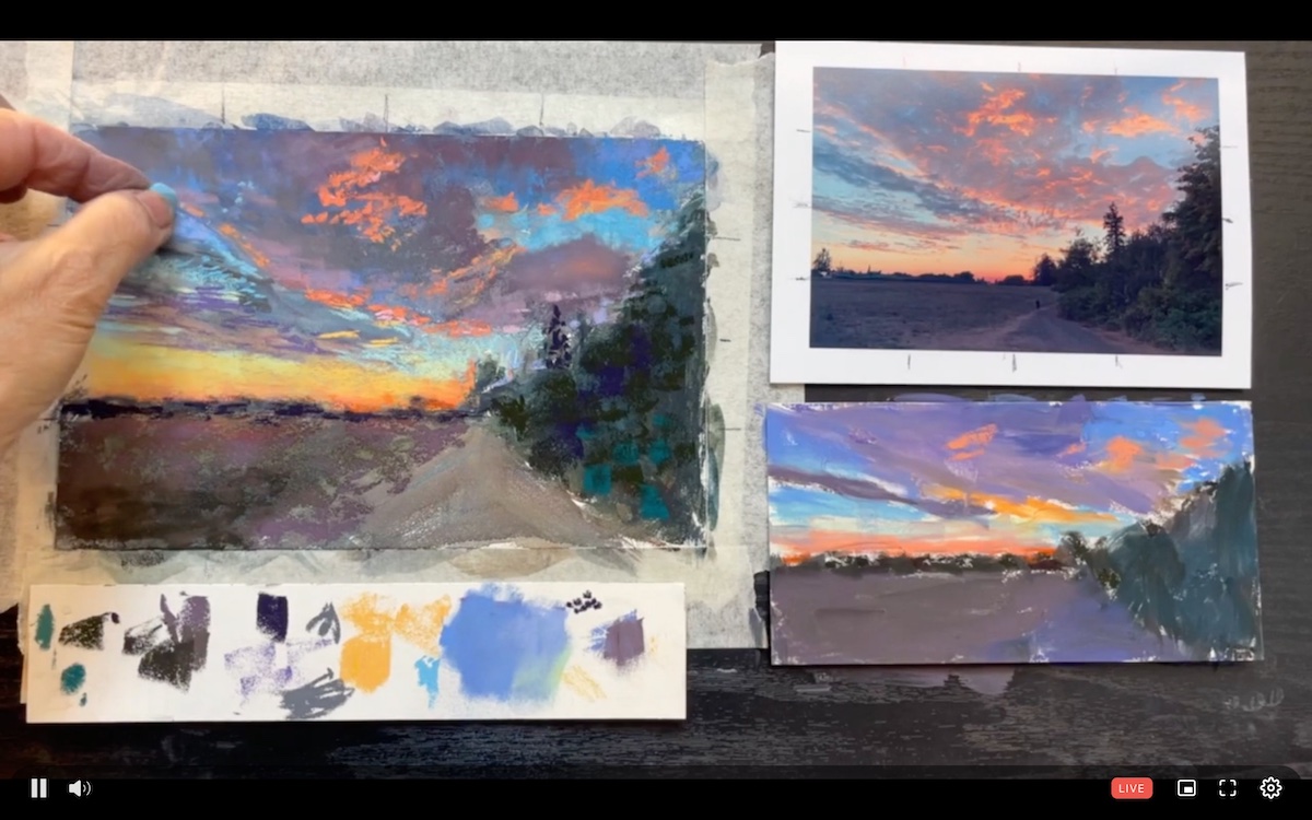
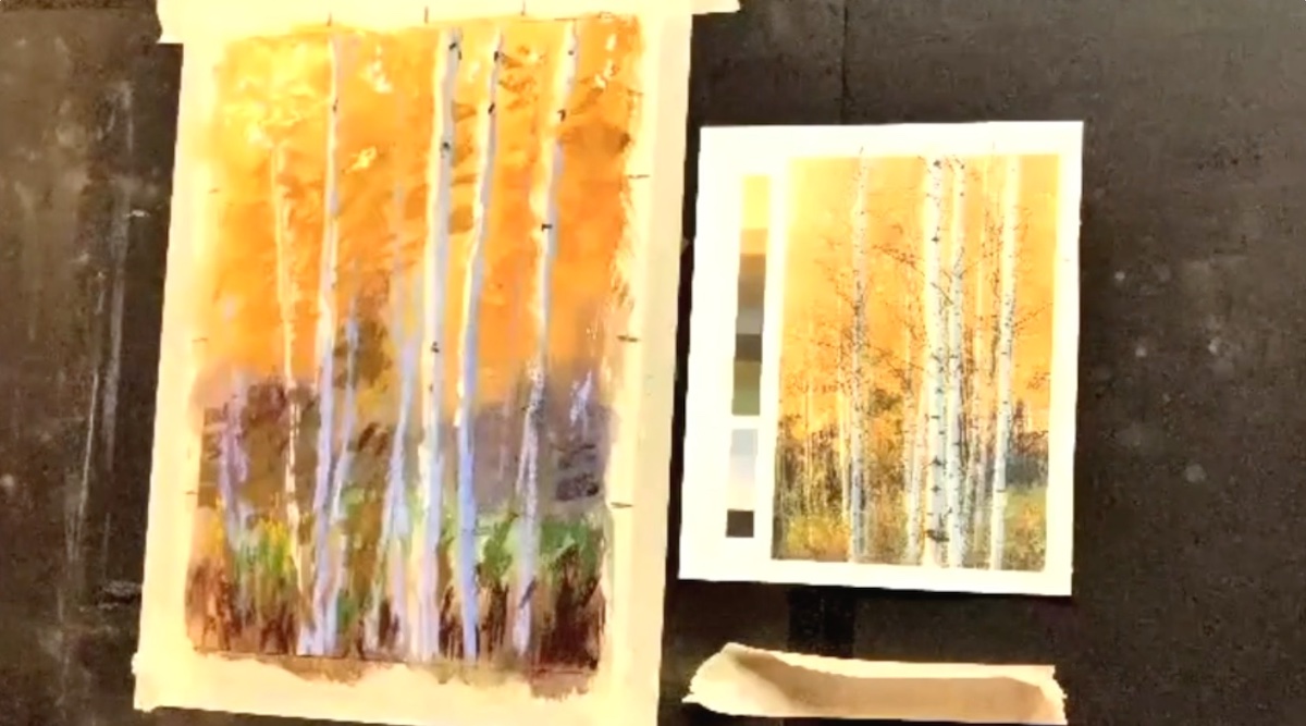
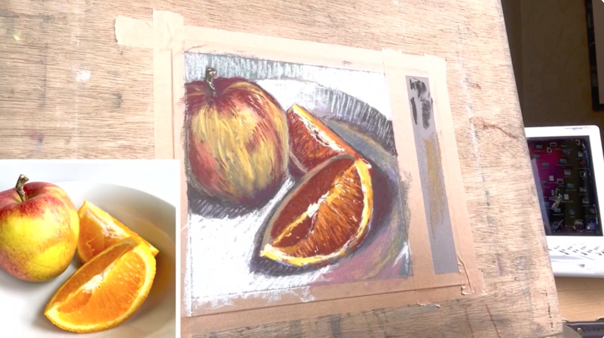
Among the day’s artists, the talented Susan Kuznitsky was the first star of the demonstration for Blick Art Materials, proud Platinum Sponsor of the event. Kuznitsky created a composition using both soft pastels -produced by both Blick Art Materials and the renowned Sennelier- and pastel pencils-CarbOthello by Stabilo.
Establishing how color harmony is important with all artistic mediums Kuznitsky recognizes pastel’s immediacy and that unlike other mediums it does not need to pre-mix colors with each other, thus taking away some of the freshness of the stroke vibrations typical of pastel.
Starting with a photographic image and a sketch made on site, Kuznitsky created a composition characterized by vivid contrasts that she shaded with pencil crayons with which she achieved a translucent effect that would allow the colors not to be blurred. Among the suggestions given by the artist is to paint as much as possible from life on the premise that: “It’s important to create the pattern of light because you are the orchestrator, the boss of the composition.”
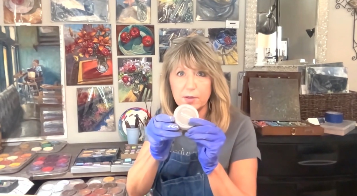
A self-respecting essential techniques day would not be one if it did not present the materials. A task that Laurie Basham handled admirably as she reviewed the different materials involved in this technique: primarily the different types of pastel, paper, fixative, alternative tools for spreading color, support surfaces, and how to preserve compositions made in pastel.
In particular, Basham treated pastels in terms of texture and form by establishing the difference between pastel and chalk and considering that, because of the concentration of pigments, the higher the concentration, the softer the pastel will be.
” What distinguishes a drawing from painting is that the former is composed of lines and the latter of shapes: with pastel you can do both,” Basham finally stated. Among the tips dispensed is how to clean the pastels: a process the artist performs by sifting the pastels in cornmeal, which she then sifts, leaving the pastels perfectly clean.
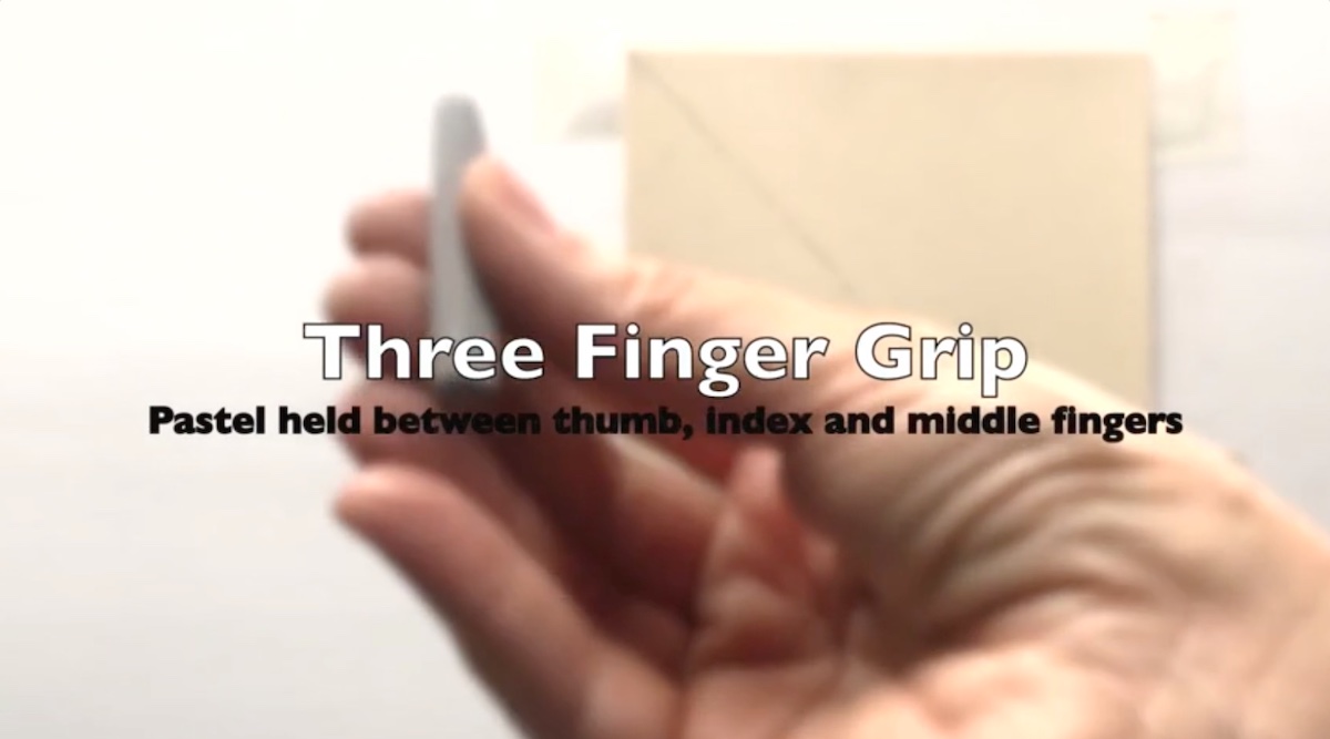
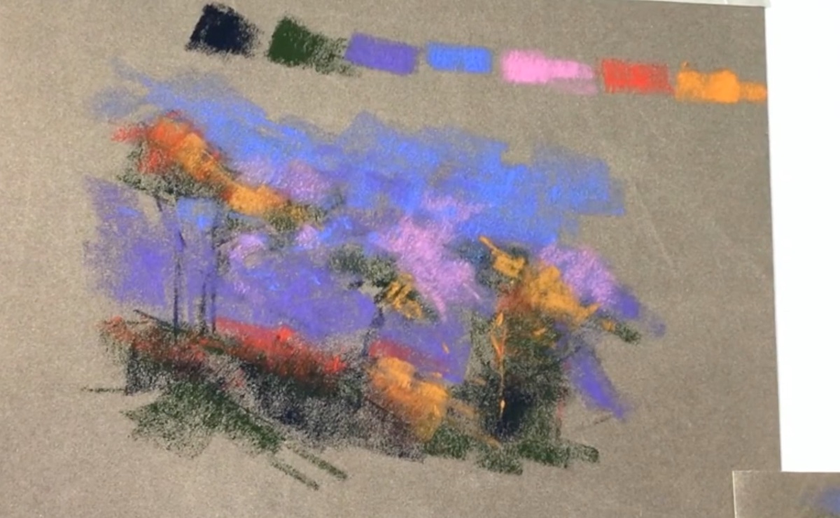
The stroke is the element that best characterizes pastel as it enhances its technical qualities depending on the pressure applied and the angle held by the pastel itself. It was Michigan-born artist Vianna Szabo who demonstrated how, “with pastel every stroke has a purpose,” said the artist, who showed different effects made by putting what she said into practice.
In the demonstration session she depicted a simple still life composition endlessly reiterating how pastel is all about overlapping layers with different pressure and stroke. She showed that through “fingers grips,” that is, the posture of the fingers with which she maneuvers the pastel on the paper she can render: light strokes, form strokes, color glazing, air strokes (atmosphere and distance) hard to soft strokes to define edges and wiggle strokes for smooth transitions in colors and values. “Through these characteristics of the pastel you can define the edges and depth of the composition,” said the artist, who uses the wiggle strokes of the pastel to harmonize colors, taking care to always be very light in the pressure imparted by the hand.
Among the suggestions given by the artist is how to correct any mistakes: a process that is feasible only if you remove the excess color in the wrong area. This allows the sheet not to be overloaded and to proceed in the next draft.
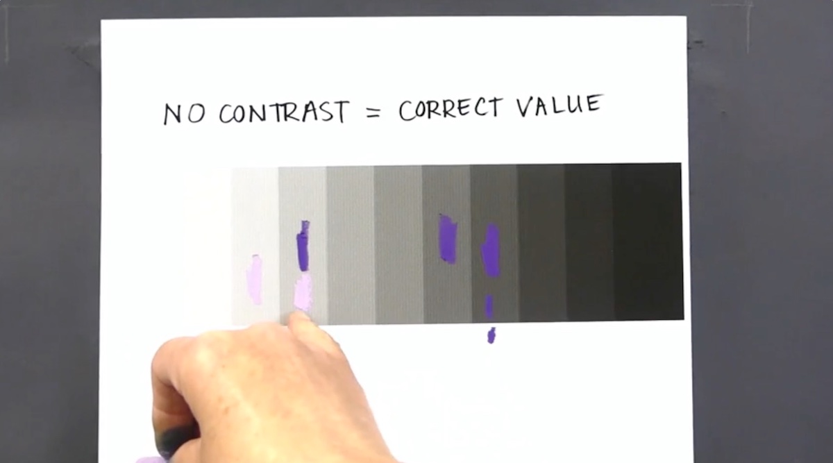
“We never stop learning about values-or at least paying attention,” said Jessica Masters who gave a specific session on the importance of tonal values. An element that primarily affects the success of a painting. Masters focused on the three pivotal elements that are the basis of any composition: hue, (which is the color, such as: blue, green, red, etc.). chroma (which is the purity of a color: a high chroma does not have black, white or gray added) and values or “brightness “and refers to how much lighter or darker a color is.
Another concept imparted was color saturation, which refers to the strength or weakness of a color. An element that can be adjusted by adding its complementary, for example. Using good supporting examples Masters effectively and simply demonstrated some methods used to establish tonal values clearly and for which the principle applies that: No contrast is the correct values,” said the artist.
Known for her still lifes, British artist Fiona Carvell showed how to make a composition in an impressionistic manner without the hyperrealist rendering of photography kept as a reference during the demo.
In the pastel composition, without paying particular attention to the block in initial, she began by defining the darks on which she later built the composition, taking care of the different structural angles of the objects represented and the balance of the composition, achieved with a very thoughtful use of color.
Passionate about drawing, the artist maintains that it is important to draw all the time and experiment with whatever mediums are available.
“Mark making is everything and light touch it’s so important and you don’t necessarily have to start with hard pastels if you have a super light touch with the softer ones “said the artist who recommends starting the composition with a darker shade of color than assumed so that the colors stand out more brightly.
“It’s so interesting how each artist has their own mark making technique, no wrong way!” commented one attendee hotly.
Demonstration about the expressive use of color is concentrated for artist Teresa Saia, as much in the underpainting -a gouache diluted with alcohol, to keep the surface juicy and fresh- as in her subsequent use of pastels to create a landscape. Watercolor is the artistic world from which Saia comes, and gouache is nothing but opaque watercolor.
In underpainting, vivid, lush colors form the background of her landscape and were arranged without regard, specifically, for darker or less darker areas. Instead, in the second stage of the process, she first made an outline drawing in charcoal, which she later refined with pastels.
Compared to underpainting, on the contrary, in pastel drafting Saia strictly adhered to the drafting of colors, proceeding from darkest to lightest in a very abstract manner and with an exceptional sense of color harmony.
Among the fundamental concepts imparted by the artist are: the use of strong values for strong colors and the drafting of color that occurs by design elements that the artist arranged following the compositional flow of the image combined with the colors of the underpainting. To do this she alternated small dabs of color -given with the tip of the pastel- with more elongated “stripes” of color- spread instead with the side of the pastel.
“Amazing use of color. I am awe-struck by this demo-I want to be her when I grow up.” said an attendee.
“I’m a big believer about the importance of drawing,” said artist Gail Sibley, who showed participants two effective methods to help themselves make a drawing correctly: taking advantage of negative spaces – the empty space around and between the subject of an image, or as Sibley said “the boundaries”- and continuously taking measurements in terms of proportions and angles. A process for which she uses a “unit of scale” that is the means by which to relate everything in relation. “This is all about noticing relationships,” the artist said on regard to this.
An example given by Sibley is the use of the head as a measure held since antiquity for the construction of an ideal classically inspired body, which corresponds to seven and a half heads.
“Any object or part of the subject can represent a unit of measurement. Normally we help ourselves with a pencil and need to keep the arm straight in front of us and close the ‘non-dominant eye that allows us to focus correctly on the measurements,” said Sibley, who also did some hands on demonstrations to provide the tools necessary for clear understanding of the concepts.
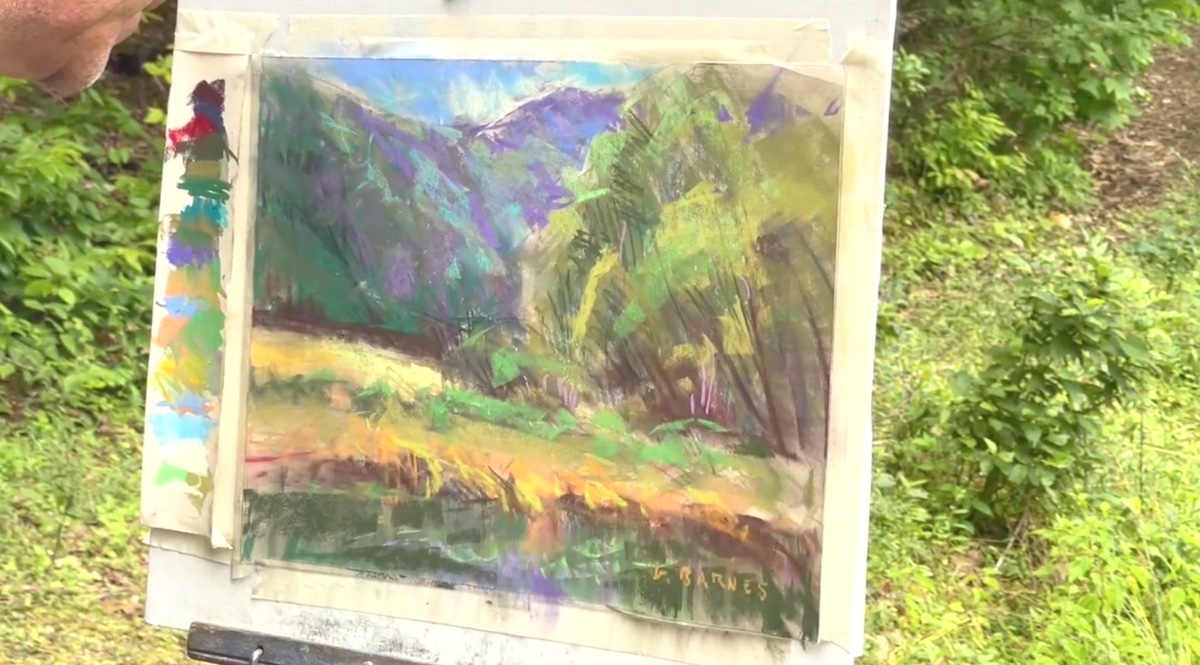
A frame from Greg Barnes’ final landscape demo.Greg Barnes, handled the pencil with familiarity to create an excerpt of a landscape among the Georgia mountains. In his compositional process, the artist initially carried out preparatory work by making quick sketches and value studies, which were followed by three precise steps: execution of the background drawing, made with a 2B pencil; the distribution of colors by generic block-in, with subsequent mixing of the colors on the sheet -with paper towel or fingers- and finally adding multiple layers of color with the same color value and different temperature in order to create details and contrasts from the “good vibrations” in the background than in the foreground. To finish he harmonized the colors with vine charcoal with which he defined the details. Among the various tips suggested by Barnes is to blur the edges of the composition outward in such a way as to focus the viewer’s attention on the central focal point while simultaneously immersing him or her in the narrative of the story depicted.
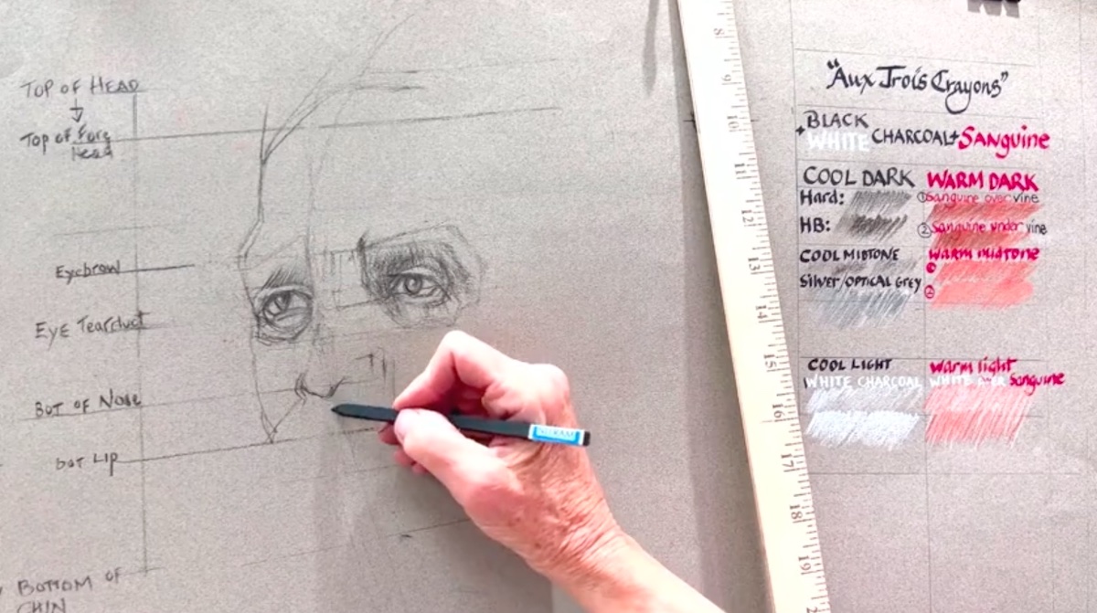
Closing the Essential Tecniques Day was artist Wendy Shalen who performed a portrait demonstration in which she demonstrated the “Aux Troís Crayons Tecnique.”
“Aux Troís Crayons Tecnique” is an ancient French drawing technique that employs white charcoal, black charcoal and sanguine for red, the intensity of which depends on the pressure exerted by the hand. Armed with years of experience behind her, Shalen showed different possibilities of using the technique and the different types of materials used to achieve it, as well as the different steps to proceed and achieve different results.
After the theoretical session, she followed up with a comprehensive practical session using Nitram charcoal, which she tempered previously to make it easier to draw. In the practical session, she also presented the elements of measurement, typically employed in French ateliers and essential to successful portraiture. Among the many tips dispensed by Shalen was to look at the drawing in the mirror upside down so as to see any mistakes and squint as much as possible to bring the tonal values into focus.
“It is slow going process initially but once the rule of thirds are in the warm/cool tonal technique moves more quickly,” said the artist.
The Essential Techniques day has come to an end, Miami Niche awaits you tomorrow for the first official day of the third edition of Pastel Live.
(on the title: The final of “Aux Troís Crayons Tecnique’s demo by Wendy Shalen)