This post is also available in:

“If you didn’t yet please, exit from your comfort zone and sign up for Realism Live, you will see your level grow up faster and dramatically,” said Eric Rhoads at the opening of the third and final day of the third edition of Pastel Live, which will give way to Streamline Publishing’s next big event: Realism Live.
Attendees of the third edition had the opportunity today to meet other members of Eric Rhoads’ formidable crew: among them Peter Trippi (Editor in Chief of Fine Art Connoisseur Magazine), who with Rhoads will be the headliner of Realism Live, and Kari Stober (Marketing Project Manager & Salon Manager) organizer and promoter of the Plein Air Salon Competition, for which I invite you to explore the following link: https://pleinairsalon.com/
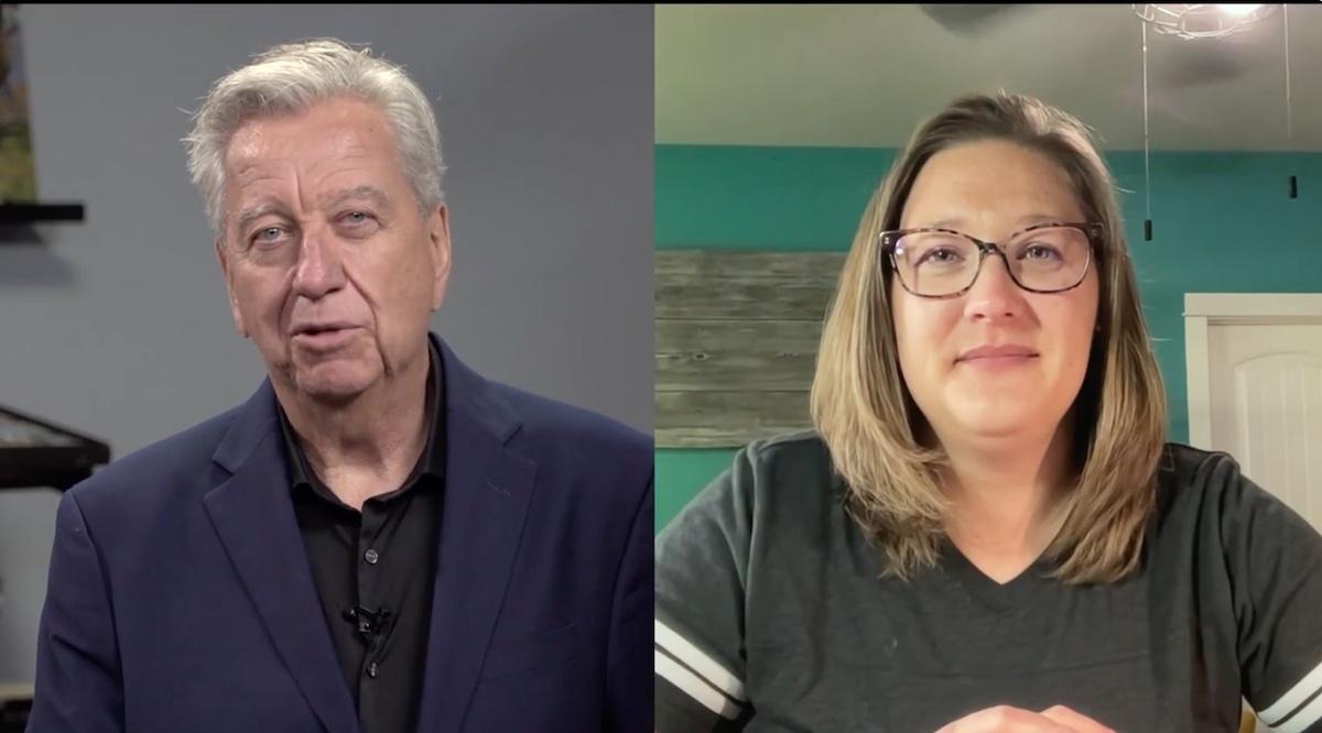
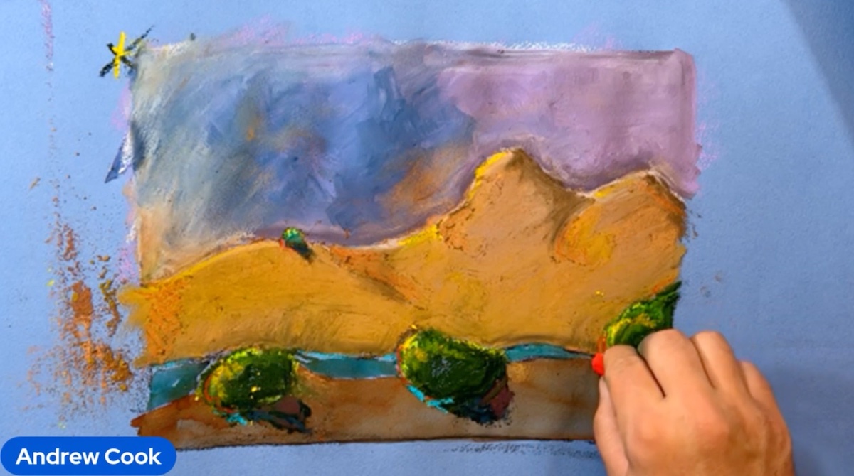
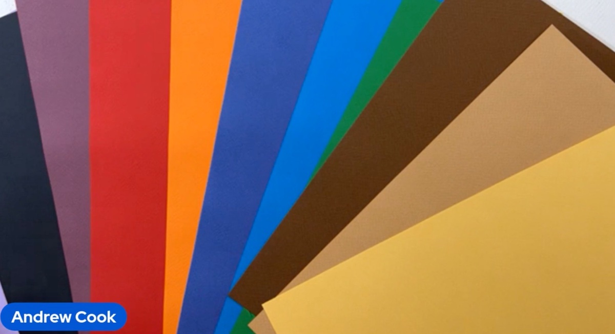
The first guest of the day was Andrew Cook, the face who took the place of the lovely Pierre Guidetti in presenting Fabriano and Sennelier products: proud Platinum Sponsors of the event. Among the new products presented this year was the new paper series offered by Fabriano: Cromia Pastel Papers. It’s a multimade machine paper that works with pastels, charcoal and watercolor. It has a grammage of 220 gsm and will be available in multiple color shades and sizes starting in November, for the U.S. market.
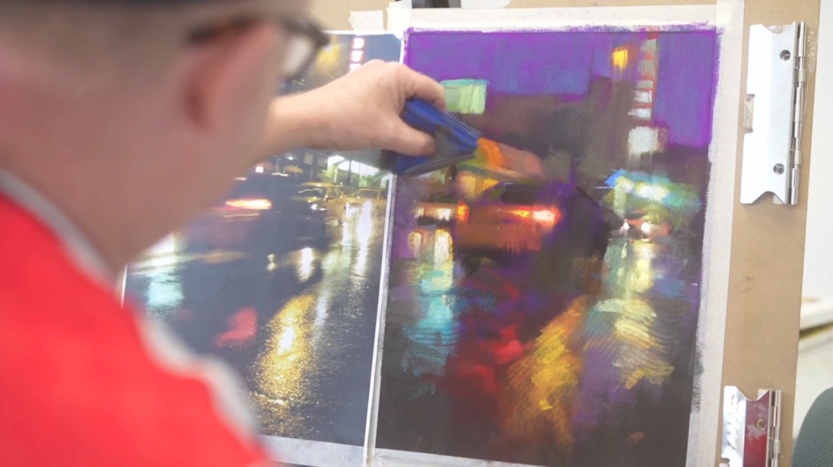
His Graphic Design and Illustrator qualities emerged spontaneously while observing the nighttime cityscape demonstration by Andrew McDermott, the first guest of the day. The purpose of the demonstration was to show how to create the “nighttime” effect in a believable way. “it’s all about lights and reflections and to build the colors and create shapes relationship,” said the artist who later built up the layers from a set of seemingly abstract shapes that became more and more realistic as they became more defined, while the lights were the device that guided the viewer’s attention to the end. McDermott does not routinely use basic preparatory drawings and converses directly with the paper and the reference image. During the demonstration he used a triangle-shaped tool with different teeth with which he made some interesting textures of the work.
In the compositional process he tends to block out middle tones so that he can control the darks more effectively later on before defining the details with highlights. Controlling the darks may seem a paradox for a nighttime demonstration but because of this, it is more complex to manage. Among the various suggestions dispensed by the artist ce was to select city lights at night: windows, stores or cars. “If you don’t won’t to add any single cars or windows stop to do it or do it in another manner,” said the artist.
“I like how the stacked short parallel strokes you’re using on the left are echoed on the right and in the sign up. High composition shape harmony,” said an attendee.
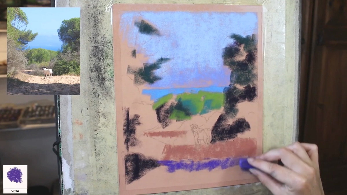
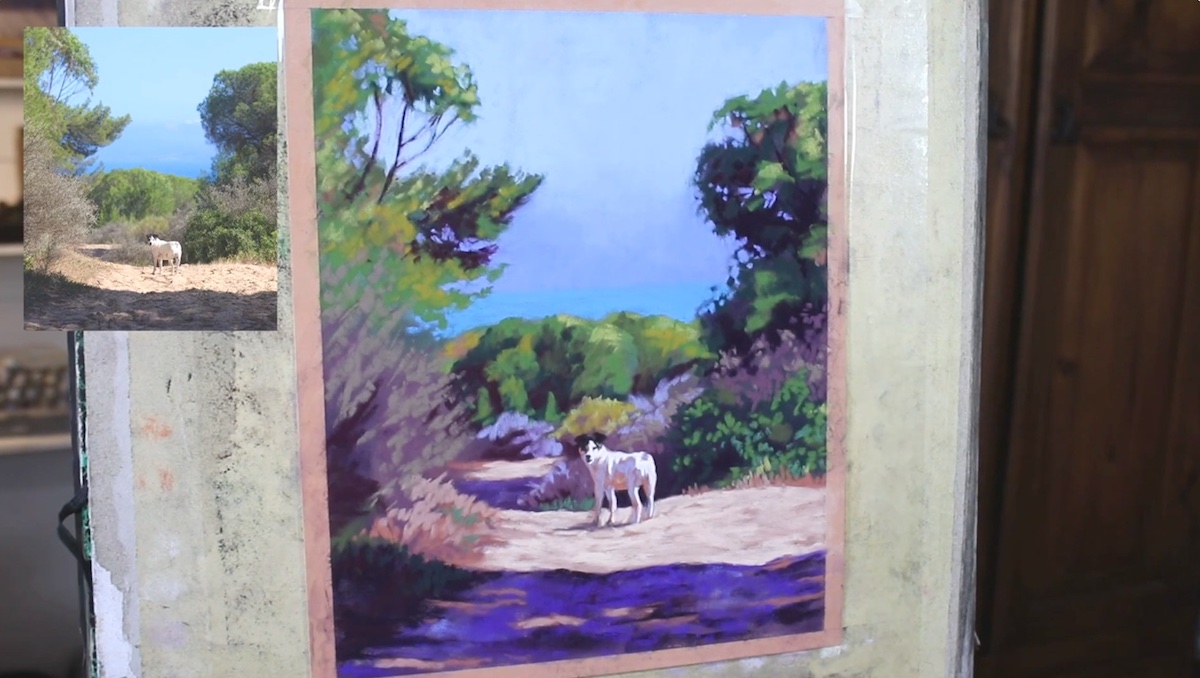
Emma Colbert is originally from Ireland and was in Spain when she made a landscape painting with a dog-her dog, Lola. She wanted to show how light reflects off the dog and the landscape and as is her style she used realistic painting rich in detail and contrast. He showed the participants how to transport the drawing made on the paper i.e. by charcoal laid on the back and later transferred to the paper on which she put a darker undertone. She generally likes to use a lot of contrasts, created with purple and green: two of her favorite colors. “Working from dark to light makes sense to me because it is much more realistic,” said the artist.
The dog placed in the middle of the scene is not accidental because dogs are her favorite subjects to depict and that she manages to render well, especially in the softness from the fur thanks to her use of soft crayons, which she uses anyway albeit on a really small size, on the dog. She uses a towel paper to mix the colors and when she is finished she lays down small strokes of color bringing out the details a little at a time. Among the suggestions offered by the artist: “the realization of the dog’s tonal contrasts, made with some gray and black, is more important than the definition of details, especially when it is small or in the distance.” Demonstrations involving animals are always a big hit with audiences who said they were “inspired” by such a demo.
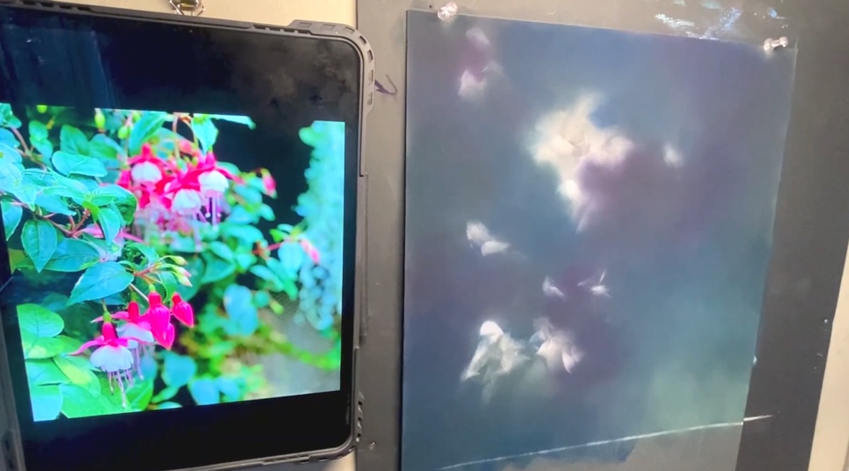
“Creativity is also a tool for thinking outside the box,” said artist Isabelle Lim, who lives in Singapore and for the demo created a kind of abstract landscape that comes to life through the process of reflecting the image seen under a magnifying glass. Taking into account all aspects related to the convexity of the lens and inspired by a work by M.C.Escher, Lim depicted a landscape somewhere between dreamlike and real, in which imagination becomes an integral part. The aim was to truthfully render the sense of illusion of the image visible through the lens. A process that requires turning the composition upside down several times in the process so that all aspects governing the principle of image distortion are well understood. Lim’s stroke is composed of numerous patches of color, which the artist imprints on the paper very quickly, creating a compositional rhythm that is also musical. Thus proceeding she carefully layers colors with different pressures and deliberately overlaps them to achieve harmonious complementary effects that offer much drama to the final composition in which the edges are all rounded.
An excellent demonstration that, as one participant put it, shows how,” “Lim’s handling of color is proof positive that, contrary to what many may think, painting an abstract work is not just about throwing paint and going wild.”
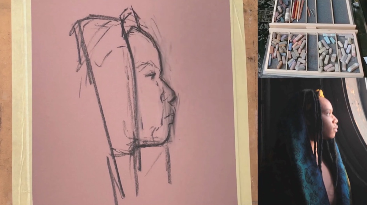
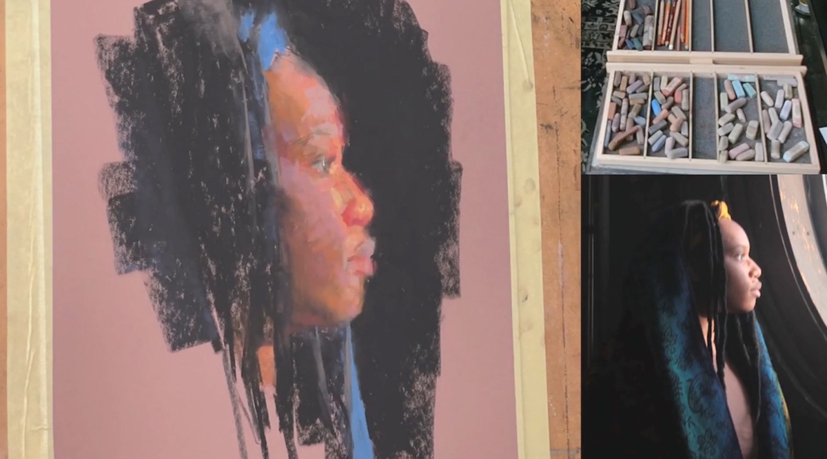
Yankee artist Corey Pitkin did a portrait demonstration whose purpose was to capture the lights reflecting off the face by explaining step-by-step how light filters through skin and cartilage in different ways. “You can define the character by the information you give to him,” said the artist. who initially traced the large shapes-which make up the facial “landscape”-with charcoal. A process that requires squinting continuously so as to focus on all the tonal values involved, he laid out using a scale of browns and grays, later refined by the inclusion of a few other colors.
Among the advice offered by Pitkin is to think of the areas of the face as shapes: “in this way it will be easier to approach the composition of a portrait,” said the artist, who proceeds by frequently checking the proportions of the face in relation to the focal points of the planes of the head. In defining the color he first included the darkest colors (a medium-dark brown and green) later he refined the casting shadow, proceeding in a defined manner by value contrasts, which he later softens by introducing transitional tones, neutralizing them with gray.
“All the touches of color he makes create the roundness of shapes, and the explanation of the halo of red for reflected light makes me think of atmospheric perspective. A wonderful lesson,” said one participant.
“Values are everything in composition,” said artist Stephanie Clark, who created a beautiful floral arrangement in the demo.
The purpose of the demonstration was to render the three-dimensionality of flowers from a two-dimensional surface, which the artist works from background to foreground, fromdark to light, giving the sense of volume and thickness of the composition in an extraordinary way. Among the most important steps, carried out exclusively by mixing colors with her fingers, is the creation of the background, which she defines in such a way that she already arranges the successive layers of color for the realization of the different shapes: of the leaves all the way to the flowers, which seem to come out of the composition dancing.
As an artist she like to talk a story just to give myself an idea so is the situation with color on the paper where the subject will sit, the color matters not at the end, “said the artist.
In representation in fact Clark tends to tell a story, which is composed of both the final visual aspect but also the telling of the various steps necessary to achieve a particular effect in terms of textures and color relegating to tonal values the task of making a composition pop up in a continuous succession of lost and found edges.
“I love that stem that goes from the background to the foreground, becoming more and more intense until it reaches the front … masterful,” said one attendee.
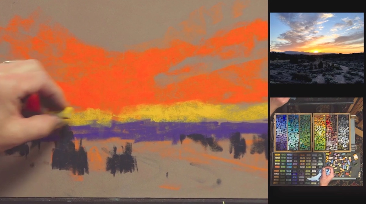
Montana artist Aaron Schuerr has created a wonderful painting depicting a sunset with the typical colors of the rural American landscape. Aaron Schuerr usually works in oil, but for this occasion he made the painting in pastel, highlighting the distinctive differences between the two mediums. The purpose of the demo was to understand the light transitions starting from the photographic reference. “Photography is a tool that I love to use to fix all those breathtaking details that I might miss in the depiction of the scene that struck me on the paper and prompted me to stop with the camera in the middle of nowhere,” said the artist.
In the initial representation he made a value study based on the pressure of the hand with which he spread the initial orange base. Later he added yellow and purple making the colors dialogue with each other until the completion of the composition in which the horizon line is kept such by the sharp distinction given by both the colors and the contrasts created.
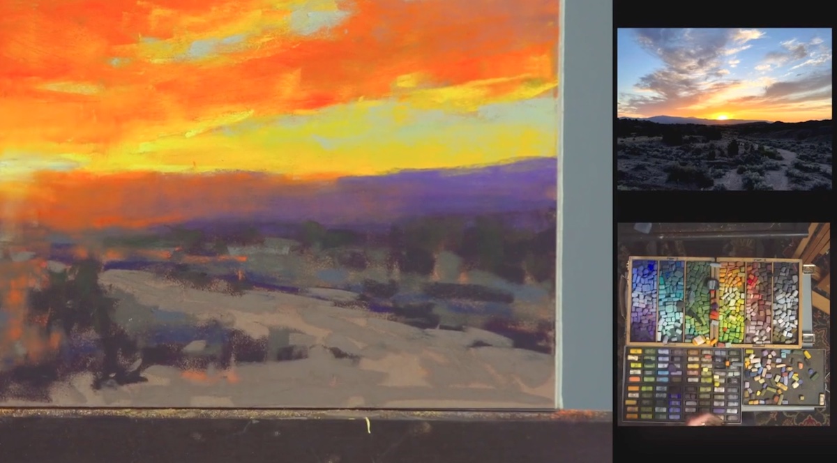
The final demonstration of a sunset was the perfect visual metaphor to close the third edition of Pastel Live.
Miami Niche and Streamline Publishing salute you and invite you to register for the next event -Realism Live- scheduled for November.
(on the title: The final frame from Stephanie Clark’s still life demonstration.)