This post is also available in:

It was Albert Handell, a living legend in the art of pastel, who did the honors at the opening of the first day of the third edition of Pastel Live.
Albert Handell will also headline the next Famous Artists School course, where he will teach an exclusive Online 4-Day LIVE Masterclass, from February 21st-24th, 2023.
For information type in the link: https://famousartistsschool.com/handell .
Conducted as usual by the indefatigable Eric Rhoads, in this edition of Pastel Live he wanted to introduce some of his valued staff members. Among them is Cherie Down Hass, who in addition to being a yoga teacher, a writer -now in her third book-her latest publication is titled: “Ashes for Williams”) is an all-around creative. Cherie Down Haas is the Online Content Manager for a number of Streamline Publishing newsletters including: Plein Air Today, OutdoorPainter.com, Plein Air magazine, Fine Art Today (FineArtConnoisseur.com) and Realism Today (RealismToday.com). Along with her were other familiar faces that attendees of Streamline Publishing events will have enjoyed on multiple occasions: Christina Angelo (Social Media Coordinator) , Kari Stober (Marketing Project Manager & Salon Manager and Sarah Webb (Vendor and Convention Marketing).
These are just a few of the faces that make up a team of thirty people dedicated, with passion and love for the arts to organizing and managing Streamline Publishing events.
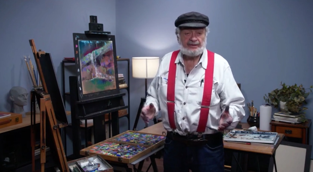
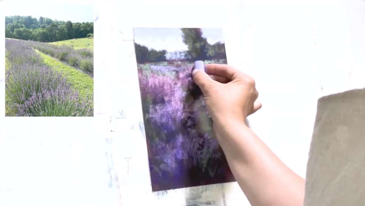
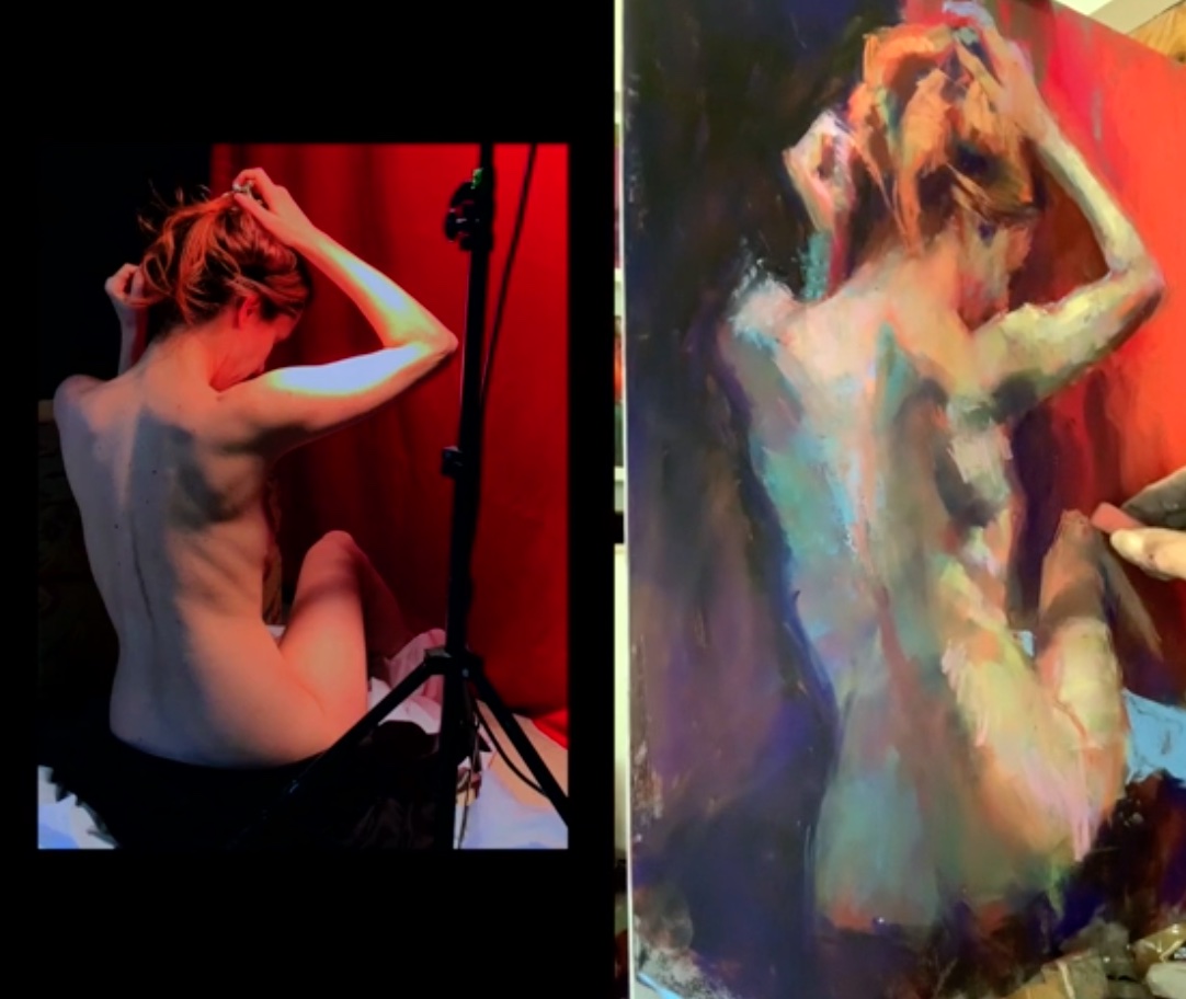
Listening to Albert Handell as he speaks is a pleasure, not only on an artistic -cultural level- but also on an emotional level, such is the energy and passion with which he is able to bring out the stunted tree branch rather than a rock depicted in all its sense of wonder. A wonder that Handell helps discover through the gestures with which he accompanies the pastels on the paper.
The subject of today’s demo was an excerpt of rock extrapolated from the union of two photographic images. Images that Handell with his boundless knowledge manages to integrate with improvised elements dictated by the artist’s extremely introverted nature.
Rocks, along with trees, streams and mountain waterfalls are some of his favorite subjects that have helped make him a legend. And like all true legends he also possesses collateral qualities such as, humility and generosity, as well as being compassionate and kind. Qualities that make him a great person as well as a great artist.
From a practical point of view Handell, in painting considers the importance of tonal values as a priority, relegating the importance of color to secondary. His “color box” is not surprisingly arranged without any general organizing principles. “An organized box put my eyes to sleep. It’s like speaking, you don’t worry about which adverb you use…you just talk,” said the artist in this regard.
Among the many quotes Handell mentioned, one in particular defines his painting style: “You have to follow the flow. With the flow you get the rhythm,” said the artist.
The enthusiasm of the participants was not long in coming to the point that it was called “A national treasure” as stated by one participant.
Artist Margaret Dyer’s in creating a figurative composition showed how to build skin tones without using pure color but building it up, individually, layer by layer in an alternation of warm and cool colors. According to Margaret Dyer, the important thing in a composition is to keep the three initial tonal values constant by changing the color temperature with the use of complementary colors. “My method is a matter of learning and repetition.” It is only at the end of the composition that she made the details pushing toward realism without, however, overdoing it, because, as the artist says, “Realism is wonderful, but it requires a lot of patience and I don’t have it.”
It was an interesting demonstration about which one participant said, “What I really like about this process it that it acknowledges all the colors that I see at the same time. Colours jumps from purple to green/ or purples have orange in them etc – she shows how both can exist – it’s not a choice between them.”
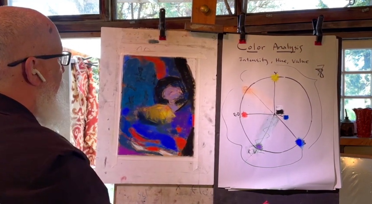
Artist Casey Klahn for the demonstration session created a still life in a contemporary version that involved the use of color in an extremely bold manner making the simplicity of still life a great sophistication, rich in color contrasts that he summed up in one sentence, “In nature, color is expressed by light and in painting light is expressed by color” said the artist. In order to do this, in addition to a comprehensive explanation regarding the construction of colors according to different methodologies: from Munsell’s theory, to the color wheel, he brought the works and styles of several great artists of the past as examples. According to Casey Klahn, the best way to study color is to study the greats of art history individually. Several names were mentioned: from Matisse -his favorite- to Malevich, spanning a time span from Cezanne to contemporary David Hockney. Essential to his demonstration is the basic concept of the use of contrasts understood as a phenomenon that is able to make the composition of a still life, generally painted without the boldness of an electric blue side by side with deep yellow or red, absolutely contemporary. “Exploit the colors boundaries,” suggested the artist, who among the various phrases mentioned quoted one, by Johannes Itten, that can absolve the beauty and magic he makes of the use of colors: “Only those who love color are admitted to its beauty and immanent presence. It affords utility to all, but unveils its deeper mysteries only to its devotees.”
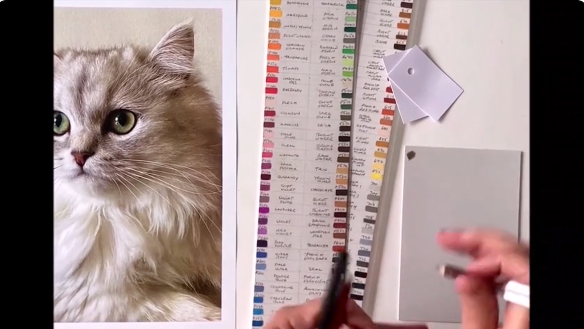
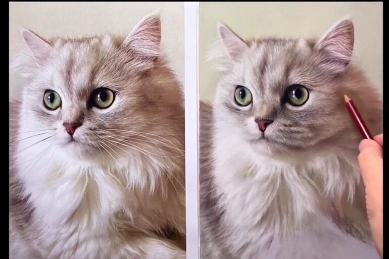
A New Zealand artist with a love of realism and hyperrealism, Julie Freeman created a portrait of a Persian cat -Luna- using Darwent’s Inktense pastel pencils exclusively. It was only near the end of the composition that she introduced the soft pastels with which she made the feline’s furry body. Soft pastels are in fact more vibrant and suitable for the purpose precisely because of the amount of pigment they contain.
The movement of the pencils on the paper was cadenced in a repetitive and relaxing manner, almost as if it were a system of meditation as well as painting. In Freeman’s stylistic logic, it is essential to select colors before beginning the composition by making a comparison between the image and the actual color spread on paper. In doing so, she made several color swatches corresponding to different areas, including: the eye, ear, facial fur and body fur. In making the demo, she started from the background to the foreground, moving from top to bottom. In this process, each color was blended with the previous one so as to make it as uniform as possible to ensure the right rendering of the fur.
Among the artist’s practical suggestions she recommended sharpening the pencils using a Use a Swann Morton scalpel to which she regularly replaces the blades.
The last artist of the first day of Pastel Live was the wonderful Jill Stefani Wagner whom we interviewed, in collaboration with Streamline Publishing, and whose article you can read by clicking on the following link:
https://www.outdoorpainter.com/pastel-painting-on-sketches-composition-and-visual-brainstorming/
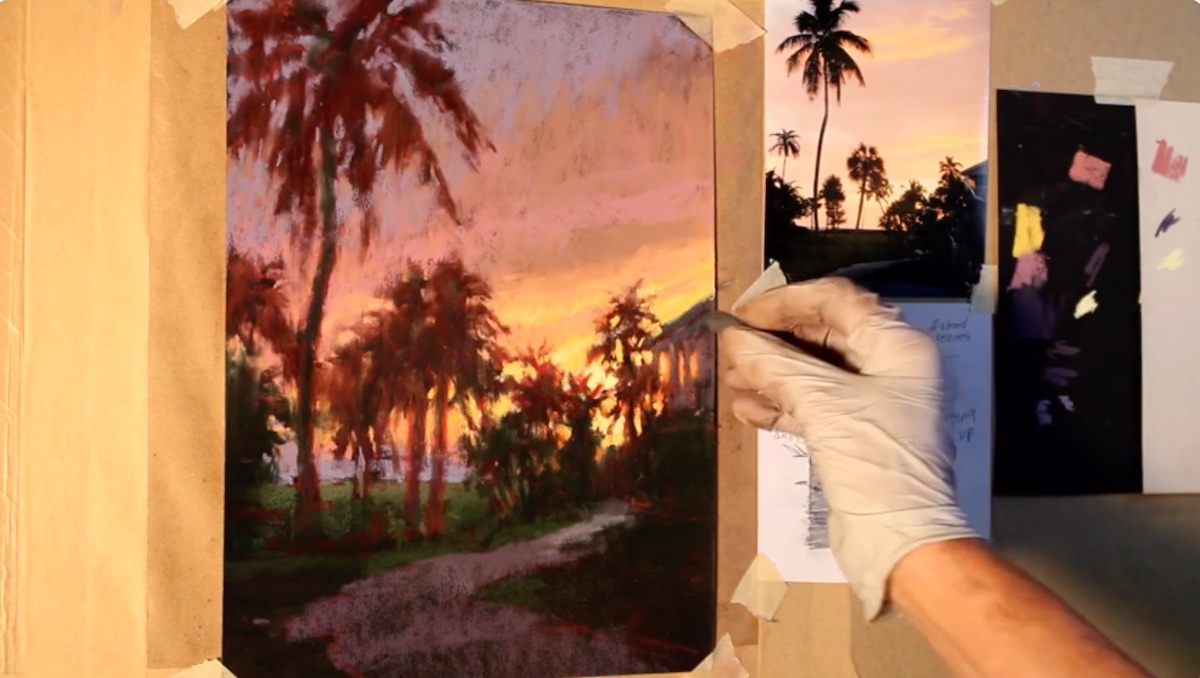
For the demonstration, Wagner created a sunset landscape from black toned paper, from which she brought out in reverse and like a pop-up all the beauty and sophistication of this kind of painting. Painting on black sanded paper in fact implies a dramatic shift in thinking in relation to color and tonal values. “Consider that the background white and black work exactly in the opposite way,” said the artist in this regard, who added: “Sky are a wild animal and the light pops up from the black surface of the paper.”
Her background in the organized and precise world of advertising was visible both in her explanation of the various compositional steps and in the presentation of the work, which basically consists of five points, including: the “love notes,” a kind of brainstorming with which Wagner punctuates the motivations that prompted her to depict that particular scene, and the definition of the focal point, which she noted on another Post-It note, placed next to the composition. This process allows her to create harmonious compositions that prompt the viewer to observe a precise focal point to which the rest of the composition acts as a surround.
Among the suggestions Wagner dispensed is the use of the eraser to make different shapes that make the composition truthful and the choice of tonal paper that should be chosen based on the tone of the scene to be depicted.
The first day of the convention concluded with the presentation of the guests scheduled for tomorrow and the announcement of the fourth edition of Pastel Live which, as anticipated, will be September 18-20, 2024 with the opportunity to register for Essential Tecniques Day scheduled for September 17. Visit the website and register at the following link: https://store.streamlinepublishing.com .
(on the title: Julie Freeman’s work in progress cat fur demonstration).