This post is also available in:


The enthusiasm of the first day of Pastel Live and the beginner’s day-for those who attended-have been invigorating for what has been the second day of Pastel Live.
Opening the dancing, in the literal sense but also in the physical sense-and Eric Rhoads’ energizing dances are a testament to that-are the presenters of Pastel Live: the indefatigable Eric Rhoads and the enthusiastic Gail Sibley, Editor in Chief of Pastel Today, the channel entirely devoted to pastel-which is totally free-to which you are invited to subscribe simply by clicking on the following link: https://pasteltoday.com/newsletter/
“When people are socially involved, they stay young longer,” said Eric Rhoads about his intention to create a Disneyland for artists.
In fact, through the events organized by Streamline Publishing -and there really are ones for all tastes and at all times of the year- people paint together, having fun and making the world a more lovable place, because it is well established, “painting makes people better,” said Eric Rhoads.
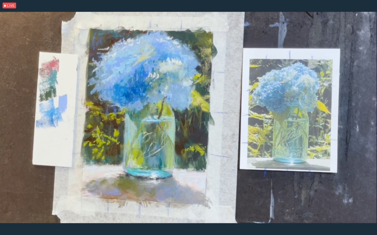
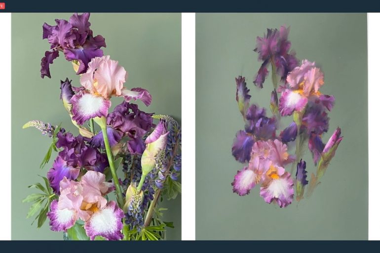
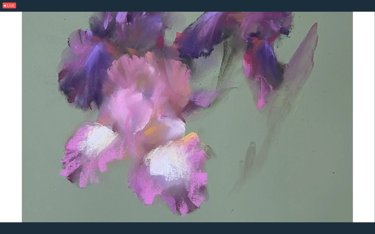
The day began with an extraordinary floral demonstration by Ukrainian artist Vera Kavura: a gifted artist who is experiencing, with her people, a truly dramatic historical period that we hope will come to an end as soon as possible.
In the demonstration session, Vera Kavura created a beautiful Iris composition: a flower that is by its very nature very interesting precisely because of the uniqueness of the zig-zag shapes that make up the petals and the poignant colors. As Kavura pointed out: the purpose of the demonstration was not to make a botanical representation but rather to paint a realization by “playing” with the nature of the flower and interpreting it in a completely subjective way highlighting its specific characteristics which distinguish it from all others. To create the painting she worked with Pan Pastels, spread initially with a sponge, to make the large shapes, and later refined with the original PanPastel tools used for their application that help her spread the colors as if they were brushstrokes. Having defined the large shapes, she made the details by bringing out the flower in all its natural lightness that emerges especially from the smooth transition of colors in which the play of definition and transparency, perfectly renders the uniqueness of the flower. “Taking care of the representation of the flower’s characteristics helps the viewer to recognize and further appreciate it,” said the artist who deliberately left some parts of the sheet shade uncovered in order to create the volume of the forms. “The intuitive perception of beauty is part of the human nature,” said Kavura, who also insisted, especially in the final redefinition stage, on the importance of increasing contrasts without losing the saturation of colors that emphasize the beauty of the flower.”
A wonderful work that hopefully will bode well for the peace of Ukraine.
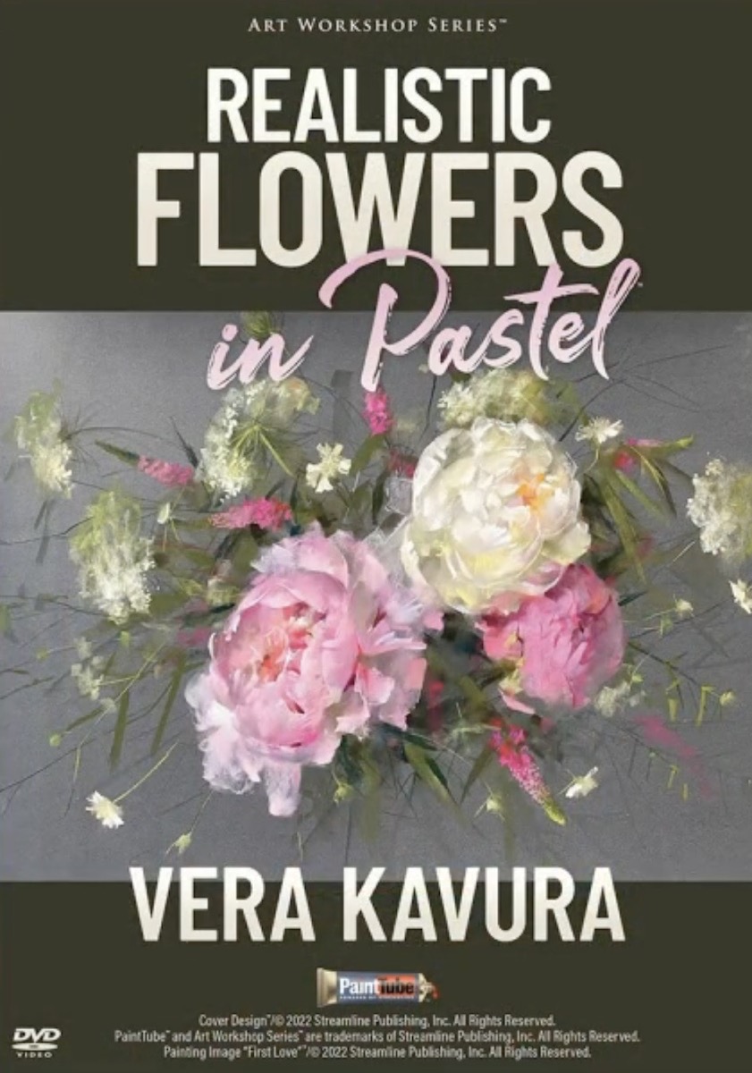
You can support Vera Kavura by purchasing the demonstration video made by Streamline Publishing and available on the website at the following link: https://painttube.tv/collections/pastel-live-store/products/vera-kavura-realistic-flowers-in-pastel
British artist Richard Suckling’s paintings are a multicolored patchwork of calligraphic marks.
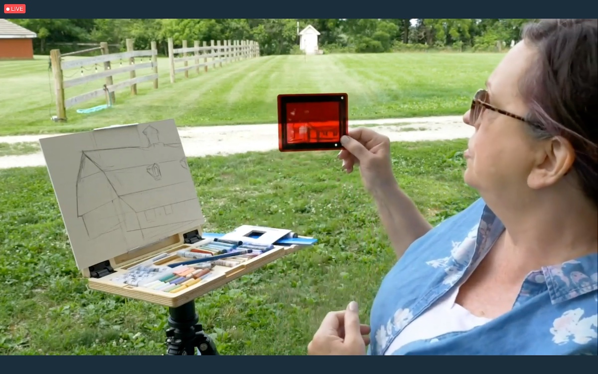
In the demonstration session, the artist showed how to properly use photographic references by depicting a hilly Andalusian landscape. Photographic references that should aim, according to Suckling, at the realization of a “fleeting instant” of the landscape and therefore should only serve as a starting point for what will later be the personalization of the work. Suckling initially made the landscape design using a limited palette of colors in a manner to create a simple and immediate basic composition. Then, referring to the directional patterning of the landscape, he laid down vigorous and powerful calligraphic mark strokes that brought out the painting in all its fullness. The use of vigorous, colorful and masterfully harmonized strokes is typical of the artist’s style, which manages to keep the cold colors dominant while letting the warm and intense colors emerge in the composition little by little. “I try to paint often from the open air because it helps me a lot to see different situations” said the artist, who, especially in defining points of light, insists on the importance of arranging light tones knowledgeably to avoid unpleasant effects: “Too many lights, looks like you’ve framed a bag of flour,” said the artist who finished the composition using random colors to make the scene more interesting and spontaneous
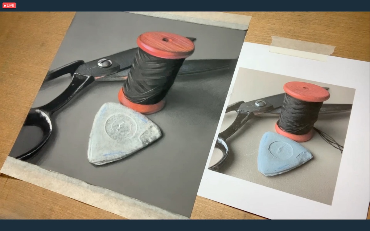
It has a romantic and melancholic flavor the still life work created by British artist Michele Ashby, who says she deeply loves pastel because of its simplicity. “The magic of pastel comes from the fact that you can create so much only with a pencil and a piece of paper,” said the artist.
Influenced by her past as a graphic designer and a search for emotions among the drawers of memory, Ashby chose to create a very simple and effective composition consisting of a pair of time-worn scissors, an old dressmaker’s chalk and a spool of cotton thread. The photographic cut chosen by Ashby also amplified the beauty of the composition in which the emotional component plays a key role in the perfect rendering of the time-worn objects. With the patience and ability to capture the details that still life requires, the artist pointed out the importance of the reflection of the lights on the objects, which varies depending on the material of which they are composed. In addition, in order to avoid unnecessary waste of money and time, the artist urged the audience to experiment with the materials on the market in order to find the materials that best match personal needs.
Among the cornerstones of the demonstration, in addition to the creation of soft and hard edges that help in the realistic definition of objects, Ashby focused in particular on certain aspects that most help in the creation of photo-realist work. These include: the pressure exerted by the hand; the variation of the angle of the crayon pencil; and the rotation of the hand in applying color to the paper. “These are all expedients that promote the correct laying out of colors and their mixing,” said the artist, who in the creation of the composition did not follow a precise order by working simultaneously on all the elements that emerge in the end in a harmonious manner.
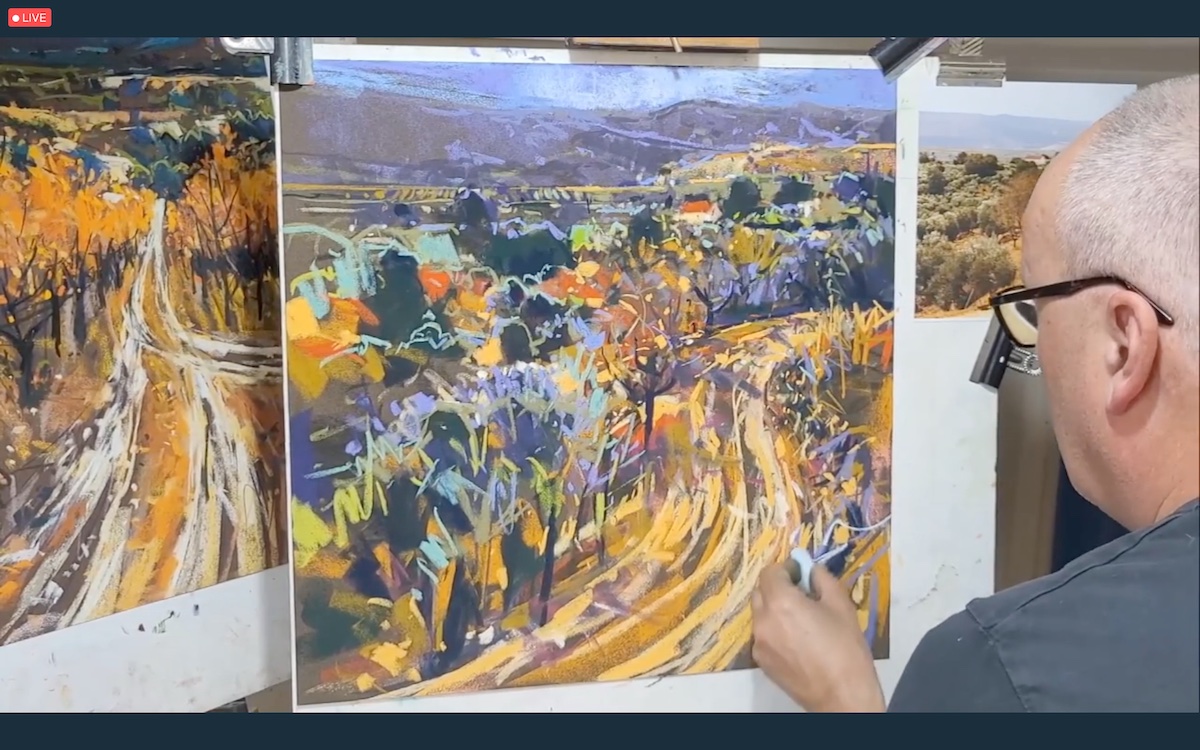
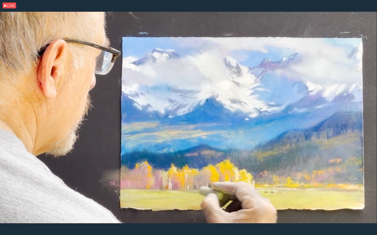
A degree in political science was secondary for the Colorado’s artist, Bruce Gómez, who gave up his career to devote himself to painting and created for the demonstration an excerpt of a mountain landscape, near Telluride, CO.
Before delving into the actual making of the composition, he showed the participants how, starting with a sheet of cold press watercolor paper, he vigorously sanded the surface of the paper, using fine grit sandpaper, until it was completely smooth and soft.
This his unique way of preparing the paper support subsequently allows the fibers that make up the paper to support both the layering of multiple layers of color and the multiple shades, without affecting the structure of the sheet.
Gómez’s is a kind of atmospheric landscape painting that the artist makes starting with a block-in of color, to which he later adds a multiplicity of layers composed of the light colors, which he spreads following the direction of the light, and the dark colors, which allow the queen scene of the composition (in this case, the snow-capped mountain peaks) to emerge in all their three-dimensionality rendered also by the chromatic contrasts.
“I don’t want to kill myself with details, so when a painting makes an impact, like this one, it’s pure pleasure,” said the artist, who to the mere representation of details prefers to involve the viewer in the totality of spectator sensations offered by the landscape that the artist has masterfully depicted.
The work created by Gómez -for sale, like all the others, in the silent action section- is a dreamlike landscape in which the beauty of the snow-capped peaks, veiled by nebulae, is contrasted with the vibrant colors of the background in a dramatic landscape contrast that contrasts the quietness of the snow-capped peaks with the dynamism of the lush nature that also characterizes Goméz’s energetic nature.
The portrait demonstration performed by Carol Peebles, a Louisiana artist, was a boon for anyone who wants to approach portrait composition in a simple and comprehensive way.
Peebles performed a live demonstration, during which she did 90 percent of the work that she later completed in the studio.
The artist approached figure drawing from life years ago thanks to her mentor: Latvian artist Auseklis Ozols, who educated her to grasp the beauty of the nuances of light in nature.
Peebles’ deep knowledge of classical basics has also helped make her especially popular with Pastel Live audiences, who enthusiastically recognized her extraordinary teaching skills. Credit for her success is also due to the wealth of information and examples with which she highlighted the most common mistakes in portrait making.
Peebles began the portrait by starting with the study of proportions, which she executed following the 3/3 rule (chin-base of the nose, base of the nose-upper orbital cavity, and upper orbital cavity-hairline) and which she checked over and over again, even in progress, to make sure the proportions were correct. For the check, she used both a handy paper segment divided into four sections and the sight-size stick, which she handled both vertically and horizontally, depending on the measurements to be taken.
“It is essential to establish the correct proportions of the face in order to have a proportionate and truthful portrait,” said Peebles, who, having established the proportions and value tones, moved on to making the anatomical geography of the skull. To verify that the anatomical geography is correct, the artist applied the 8-point technique, which allows the symmetry of the face to be measured. Another system used was the analysis of the negative spaces between the parts. “Having established the foundations of the drawing and tonal values, we get into the details by defining the details that allow us to highlight the peculiar characteristics of the subject,” said the artist.
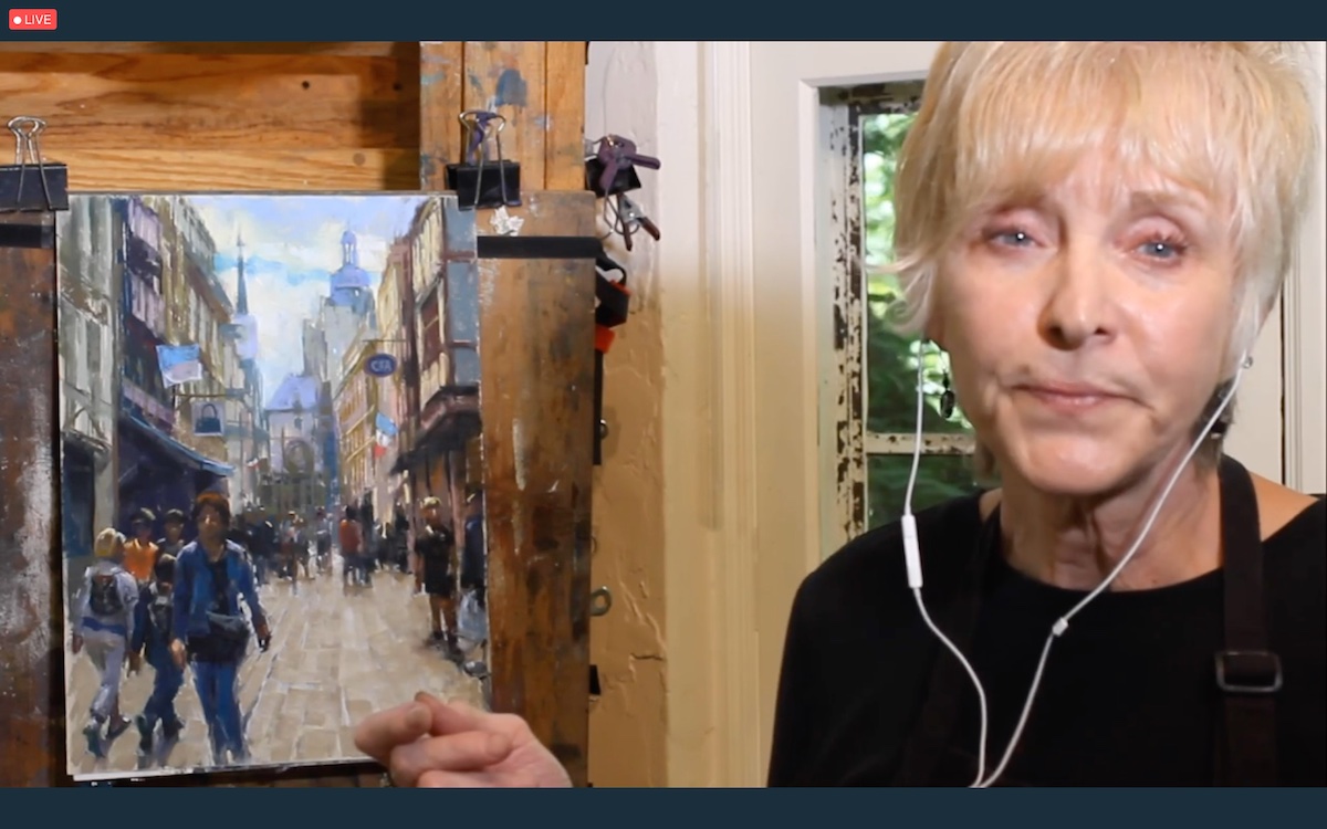
The last demonstration of the day dealt with another important theme in painting: perspective. And it was artist Nancie King Mertz, recently awarded the “Eminent Pastelist Designation from the Pastel Society of America,” who created for participants one of the iconic streets of Rouen, a French town in which the artist has stayed.
Mertz’s mastery of the composition can also be seen in the fluidity and speed with which she defined the perspective points on the surface of the paper with a wine charcoal. “The first thing to do in perspective, and the most important thing, is to cosider the sight-light horizon line,” said Mertz, who later related her horizon line to that of the landscape and people. She then represented the elements of the composition as simple shapes that have their own tonal value. To amalgamate the colors before proceeding from depth to foreground, in the realization of the details, she spread denatured alcohol with a fan-shaped fun brush that dries almost immediately. “You have to think of pastels as a paintbrush,” said Mertz, who knows exactly where she is going with her quick brushstrokes. Mertz argues that in order to make a perspective as realistic as possible in addition to the basic rules of painting, which include for example: the progressive reduction of the size of objects relative to the point of view, it is necessary to pay attention to factors that are sometimes overlooked, such as edges for example that lose definition as depth increases. “Only by adopting the rules of perspective will it be possible to engage the viewer, as if he or she were walking toward the scene,” said Mertz.
It was again the talented Susan Kuznitsky who aroused the curiosity of the participants who witnessed the completion of the work she began yesterday with Cretacolor Pastels. Work that she completed today, again with great detail in the description of her actions, thanks to Sennelier’s iconic Pastels à l’Écu.
No less inspiring was the demonstration by Julie Swanson Davis for Blick Art Materials, who showed participants how to create a landscape composition by focusing the elements with the composition finder.
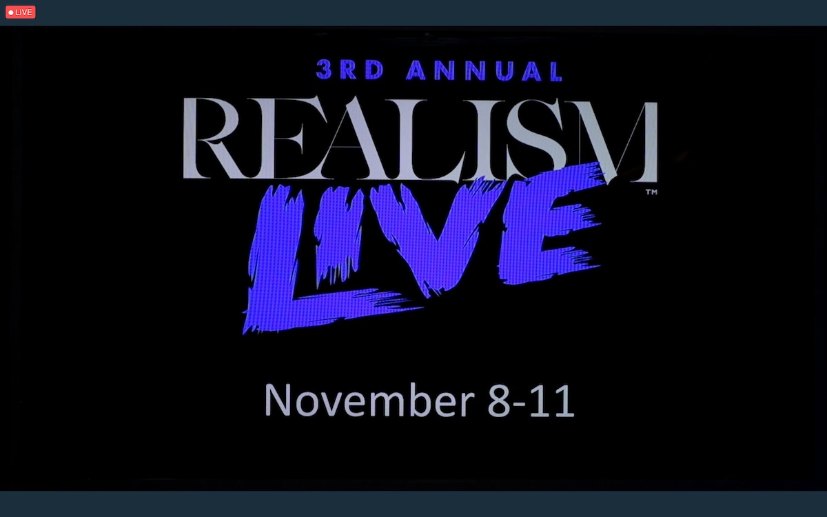
Closing the day, Eric Rhoads introduced what will be the next Streamline Publishing event: the third edition of Realism Live. Produced in collaboration with Peter Trippi, Editor in Chief of Fine Art Connoisseur Magazine, Realism Live will be online Nov. 10-12 with the option of adding the optional pre-event training day scheduled for Nov. 9.
(on the title: Vera Kavura’s work in progress demonstration)