This post is also available in:

The official start of Plein Air Live was presented, as usual, by the duo Eric Rhoads and Kelly Kane: familiar faces appreciated by the ever-growing and enthusiastic audience, which this year counted the participation of people from eighty countries.
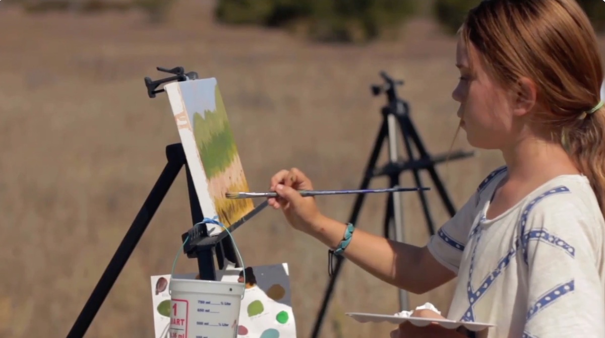
Plein-air painting represents the cutting edge of art since the beauty of its rendering and the ability to reveal to the artist a new way of looking at the world are indispensable characteristics of plein-air painting. Characteristics that are, likewise, directly proportional to the difficulty of execution: painting outdoors in fact presents significant pitfalls mainly due to the sudden changes in light that are sometimes difficult, especially if done by a neophyte. Moreover, translating a live image to a photographic reference implies a multiplicity of aspects to be taken into account, which is not the case for the representation of a photograph. More often than not, moreover, plein air painting is associated exclusively with landscape art, and it is no coincidence that impressionist painters are among the most highly regarded artists for their refined ability to translate simple impressions onto canvas. Nevertheless, and as demonstrated during the convention now in its fourth year, anything is possible: you just need to know how to rely on the advice of those who have been practicing and teaching plein air painting for years, saving failures and years of study.
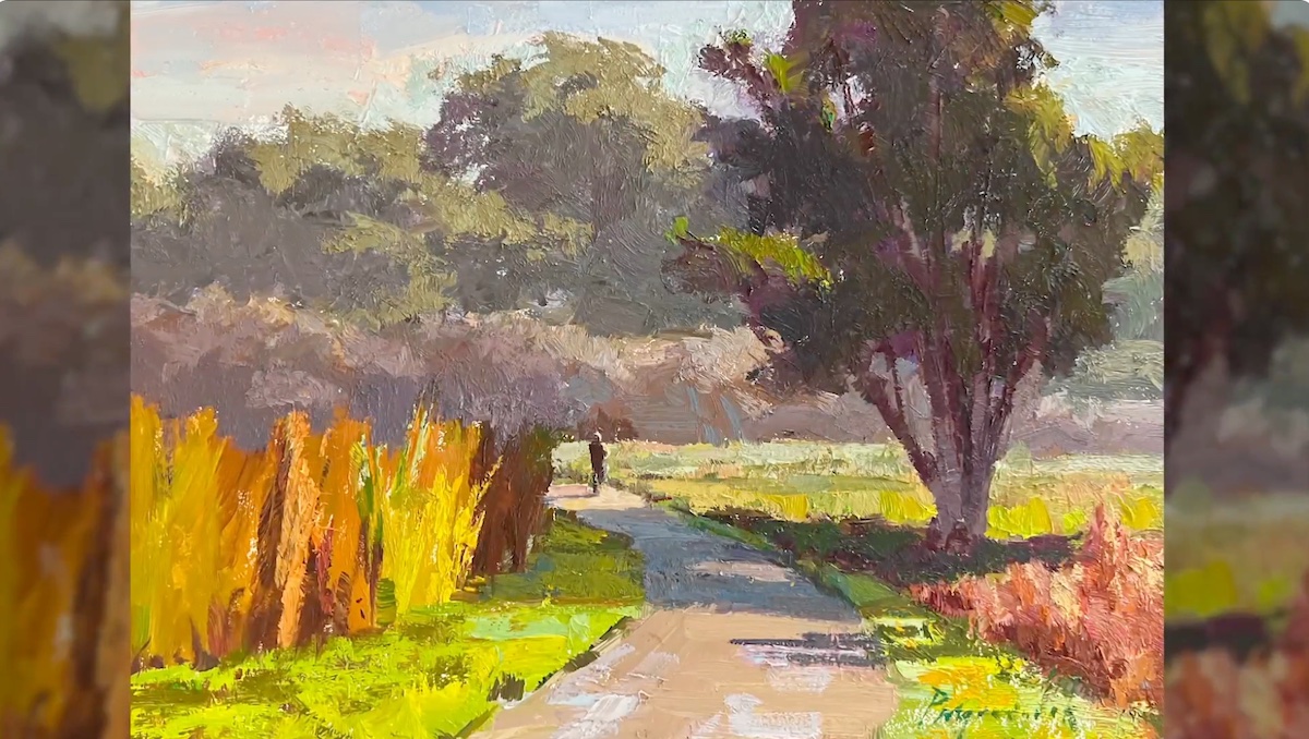
The first faculty member of the day was Camille Przewodek: an authority on the knowledge and use of color. For Camille Przewodek, plein air painting represents:”the dialogue that I have in my mind as I paint,” said the artist, who made an excerpt of a country road in Petaluma, CA.
The basic elements of Przewodek’s painting are a rigid organization of colors, which she studies in advance and the constant cleanliness of the palette. The drafting of the visual layout with which she summarily represented the compositional elements was followed by the drafting of color, which she accomplished with continuous temperature variations and an “exaggeration” in color saturation that she controls later with the study of light and shadow.
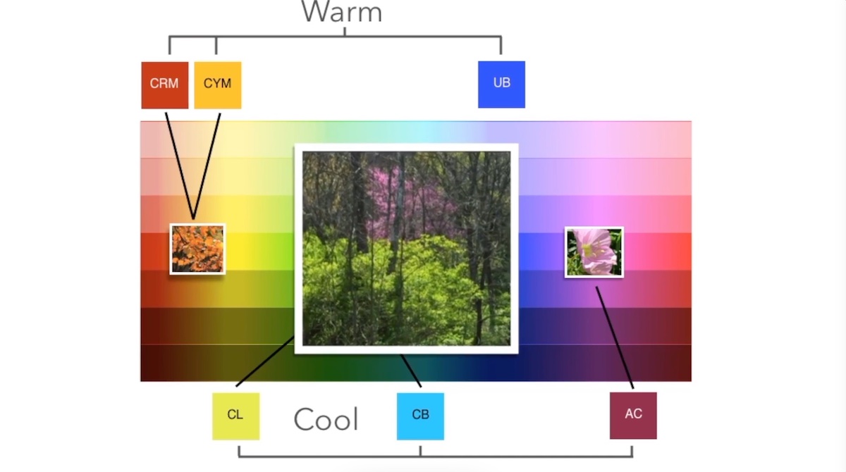
The use of a saturated palette helps the artist to preserve the light of the painting: ” Using different colors adds to painting the light key of nature and painting the aerial perspective,” said the artist who pointed out how:” If you paint the light key of nature you automatically get color harmony. But, painting the “color key” is a confusing concept. Knowing what colors create that key is challenging,”
Przewodek also emphasized how everything in light tends to be warmer than the notes of shadows, which are equally important because they tell a lot about the narrative of the story. After arranging all the colors that brought out excellently the harmony of the landscape dense with textures -an element that the artist also searches for with the use of a palette knife with which she scraped the color to create movement- she finishes the composition with the arrangement of details that she sometimes reserves to make indoors in the studio.
The end result is a harmonious and richly colored composition with which she interpreted a dreary winter day by transforming it into a spring landscape. In the demonstration, Przewodek used the Paint-Saver Palette and Soltek easel: tools that she personally designed to better suit her needs and that are currently on the market.
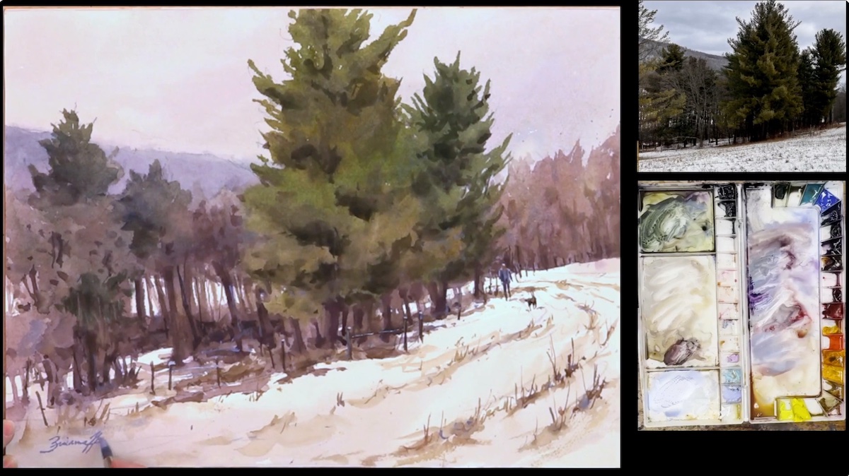
The key phrase in Brienne Brown’s watercolor demonstration depicted a snowy Pennsylvania landscape is, “Create a mass that refines the edges.” A rather strong statement that was followed by a reassurance from the artist’s personal experience, who said, “It does take practice to build up the confidence and watercolor takes faith.”
In the demonstration, as well as in the making of her paintings in general, Brown does not just copy but tries to create a painting that has its own story and a personal point of view that aims realistically, simplifying forms impressionistically and focusing on matching values.
From this concept, she made the composition by first dwelling on the study of design: not only in terms of background design but also in terms of pictorial design. After laying down different washes, in which she incorporated different color temperatures -warmer foreground and cooler background- she varied the consistency of the watercolor (more dilute in the first wash and increasingly pigment-rich and water-poor in subsequent washes.)
Pigment concentration is a key element in Brown’s compositional process. It tends to be denser and denser, especially in the final stages of composition where, with calligraphic strokes, she highlights certain compositional details using mostly neutral tones, especially near the snow, which she tends to “dirty” with rinse water and on which she then “draws” decorative elements that also serve to balance the composition. Another key element in her style is the attention to the edges, which she tends to soften with the application of color with which she has abstractly reinforced -and with an eye to negative spaces- the foliage of the trees in the foreground. “It is important to never think of the forms for what they are, like the trees, for example, but to think of them abstractly as if they were forms in their own right that converge harmoniously at the end of the composition,” said the artist, who made a final temperature change to harmonize the whole.
Among the various insights offered by Brown were a couple of partisan tips for speeding up watercolor drying in the cold. The artist uses alcohol, which she dilutes to water, and dries the different stages of the washes using car heating.
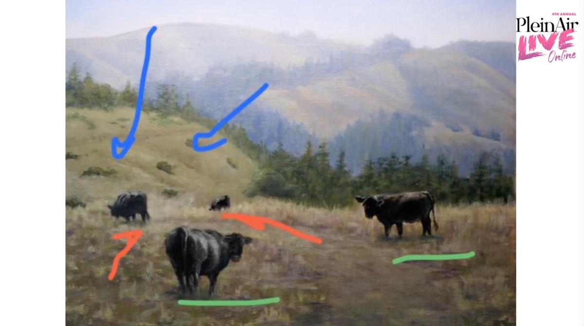
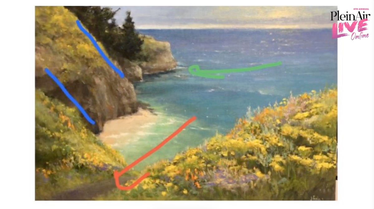
Artist Kathleen Dunphy, in addition to being an internationally renowned artist, is also a valued teacher. She has therefore been entrusted with the task of performing the critical session. As an instructor, Dunphy considers critical sessions to be a very important aspect of the compositional process, although, as the artist stated:” they represent only an opinion, a food for thought, which does not necessarily have to be a technical correction.”
Critical sessions are in fact an excellent tool for correcting errors visually or mentally not perceptible by the material performer of the composition. In addition, attending other artists’ sessions is good because in this way personal emotionality takes a back seat in favor of information, advice and opinions that are universally relevant to all artists, who tend to repeat the same mistakes, which may be: an incorrect angle due to the tendency of the human being to render everything in a linear manner or an excessive saturation of color in respect to compositional harmony. Dunphy’s was a session particularly appreciated by the audience who said, “I love these critiques, because I’m thinking of some of my paintings that could use some of these great suggestions.”
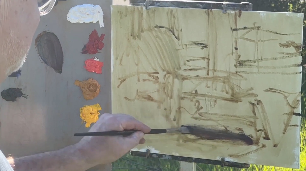
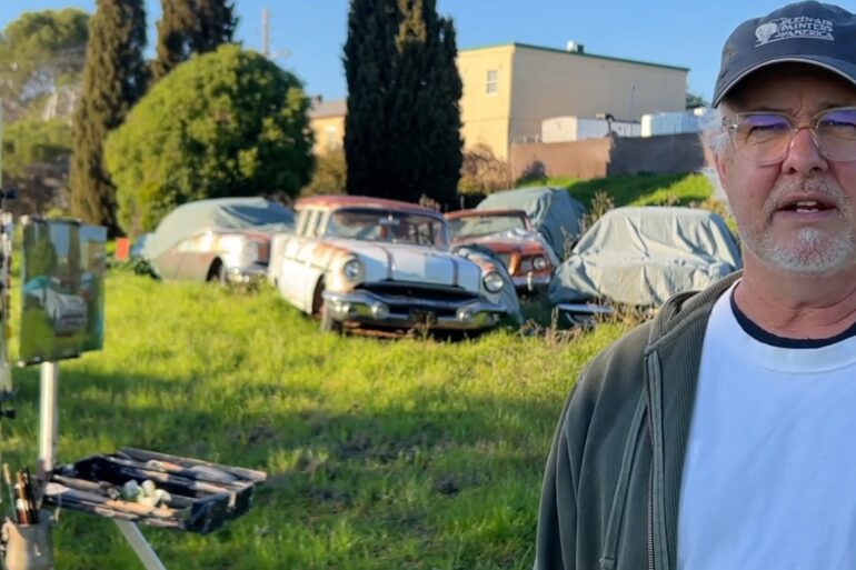
Called The Painter of Painters by Jean Stern, director emeritus of the Irvine Museum of Art, Randall Sexton created a composition for Plein Air Live depicting one of his favorite subjects: an old abandoned vintage car. The artist said he loves painting these old vehicles because they allow him to embrace a lot of challenges that enable him to simplify a complex subject.
According to Sexton: “Painting in plain air is like speaking a different language with which you can say more with less. And for that, It’s a big challenge,” said the artist, who likes to make “portraits” of old cars, highlighting their body composition and dwelling on the fascination of old windows: so full of stories to tell.
Among the focal points of his painting philosophy is the simultaneous arrangement of tonal and chromatic values. He began the composition by working on an underpainting, made with a warm neutral mix w/ some medium -Walnut Alkyd Medium- just before to start on which he initially made a sketchy drawing later laying down color with a limited palette, based on the value of masses. Among the various secrets revealed by Sexton is the importance of the intense use of contrasts, which he sometimes makes with complementary colors. The use of contrasts is comparable for Sexton to a jigsaw puzzle: ” At first it looks like a mess but then everything finds its place,” said the artist, who gradually builds up the composition without dwelling too much on individual sections.
Before finalizing the composition by adding details he works finely around the foreground subject by arranging tonal and color values that emphasize the three-dimensionality of the vehicle.
Regardless of the artist’s degree of mastery, which is obviously the result of years and years of study, he stated how:” in a painting process it is necessary to get lost in the compositional process, based on making a mess and then putting everything back in the right place, always taking care to be confident in oneself.”
Australian artist Colley Whisson’s demonstration, characterized by a calm, suave tone of voice, is an excellent example of why one should not be a slave to photographic images that are always less appealing than personal interpretation of history. “A story, however, that must come across as believable,” the artist said.
Called one of the world’s best impressionist painters, the artist and son of art, prefers to describe himself as:” a good navigator when giving directions.”
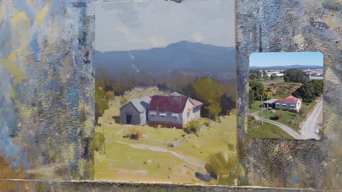
For the demonstration session, Whisson, aided by his son’s help in both the photographic representation of the image with the drone and the construction of the demonstration session, depicted an excerpt of the landscape of Brisbane, the Australian city in Queensland, where he resides. The artist said he works on the photographic image on the strength of his long journey from plein-air painting, which enabled him to correct photographic distortions.
Whisson said he is much more interested in the mode of representation rather than the subject matter to be represented. He believes that the purpose of painting is to accurately paint the scene being interpreted so as to truthfully convey, through free and spontaneous impressions, the set of emotions triggered by the scene.
For composition, he used mainly flat brushes with varying brush strokes depending on the section involved. He used, as usual, synthetic brushes with which he worked on a panel the size of 10 x 12″, made by hand and covered with plaster. In the composition he was careful to streamline and simplify the compositional elements. Starting with a quick realization of the main shapes useful for fixing ideas he laid out working at the first, larg, tonal contrasts that he later adjusted in a continuous back and forth to bring out the subject.
Whisson sees the brush as the tool needed to dig into the light. Light that represents an obsession for him and that thanks to his ability to visualize the mark before its execution he is able to capture perfectly, making his approach more fascinating.
In executing the work, the artist said that he normally takes his cue from simple ideas that he then makes imposing thanks also to the “depth” factor: another important concept for the artist who said, “people love to see in distance and you have to maximize the distance with the perspective.” To create depth he focused on atmosphere by balancing the compositional elements and serve to balance the color of the composition which he achieves with a purposeful color transaction between the elements in the distance and those in the foreground.
A final suggestion offered by the artist to the participants, and part of his compositional process, is to lodge the painting in a corner of the studio and look at it from a distance with fresh eyes-a great tip to be able to visualize any errors or details that need to be added or amplified.
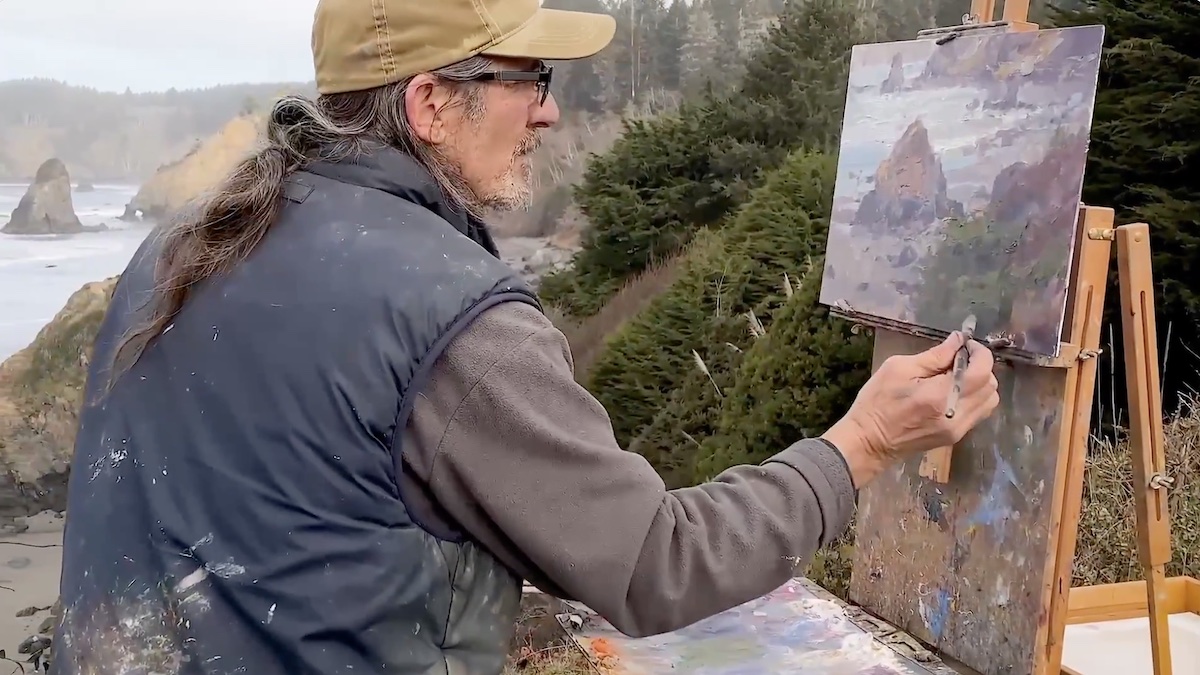
Closing the first day of Plein Air Live was artist Jim McVicker, who demonstrated how painting represents for him “a gesture to honor the beauty of nature.”
For the composition, which he executed in an extremely gestural and frenetic manner, as if he wanted to physically enter the work, he created a breathtaking cross-section of the coastline of Trinidad State Beach, California.
In seeing McVicker in action in trying to capture the atmospheric variations of the morning light, with its constant and sudden changes of light, one can hardly believe why fifty years ago he decided to quit his day job to devote himself exclusively to plein air painting. His first plein air event is in fact dated 1973, and he has come a long way since then, immersed in the paradisiacal nature of California.
To achieve the final compositional levels, which are as dramatic as they are poignant, McVicker initially aided himself with the quick definition of light and shadow with which he established visual elements using an initially gray palette. In pursuit of the connections and relationships between the parts, the artist then began to lay down color composed of the three primary colors to which he later added cobalt purple -for the shadows- and lemon yellow mixed with white, for the definition of the highlights.
McVicker’s exciting demonstration went hand in hand with the multilayer construction of the color, which participants watched take shape until it became thicker and thicker. To spread the color in a textural way, the artist helped himself to a palette knife, which he handled in a very poetic way: sometimes abruptly and firmly and sometimes gently caressing the composition.
His way of painting in a continuous and frenetic movement allowed him to capture multiple points of view, hardly perceptible of a static artist. The continuous movement also allowed him to work in profile with respect to the scene to be painted: in this way he avoided the reflection of light on the painting.
But in this perpetual and tormented whirlwind of movement it is the artist himself who reassures the participants by stating that, “Among the things to fear in life: painting is not one of them.”
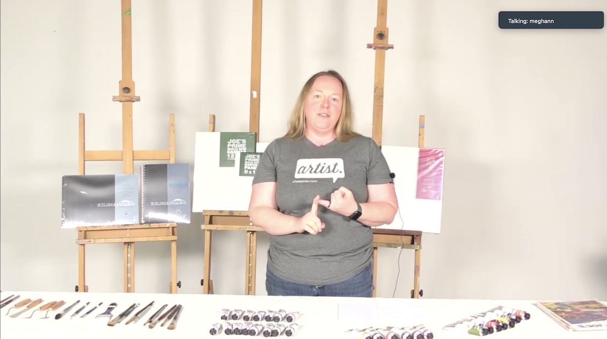
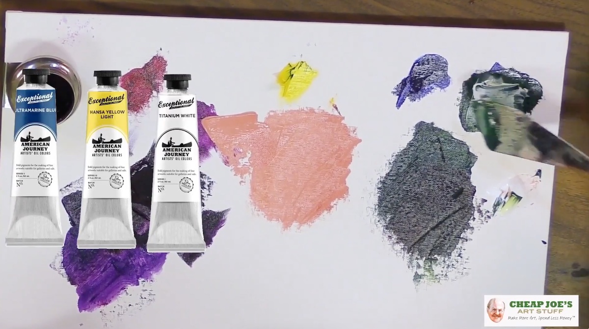
Among the day’s Platinum sponsors Cheap Joe’s presented a demonstration session in which Bryan and Meghaan Miller, granddaughter of Joe Miller and third-generation artist incorporated into the company, told the story of the founder of Cheap Joe’s. A background as a pharmacist that Joe Miller abandoned to pursue his dream of pursuing art in a particular way: that was, opening a company that would be able to produce its own materials that were of quality but equally accessible to all budgets. Like many other historical sponsors, Cheap Joe’s also relied on artists to present its products. Among them, Julie’s infectious smile has become a familiar face to all who follow Cheap Joe’s events. In today’s snippet in particular, Julie presented the latest oil paints from the American Journey line, which you can find at the following link: https://www.cheapjoes.com
Miami Niche awaits you as usual tomorrow with the second day of Plein Air Live a reminds you that registration is already open for the fifth edition of Plein Air Live.
(on the title: Raandall Sexton and his final work demonstration)